It should not be surprising that the man famous for his brand designs looks a bit like a product icon himself.
A self-described “solitary introvert”, Parisian Pierre Katz has a track record of successfully designing or refreshing logos and labels of many of the world’s most famous wines and spirits, hoping to lure consumers with the compelling authenticity of their labels.
Working at home in the apartment he shares in the 11th arrondissement with his artist-wife, Clara Ramirez Katz, Pierre Katz stares out at his world through thin-rimmed glasses, his hooded, eagle-like eyes locked onto the images on his computer screen as he teases out intricate designs, moving the interspacing between letters by a hundredth of a millimetre or redrawing yet again a miniscule curve on the upstroke of a letter.
Momentarily satisfied, Katz hits ‘Print’, then spreads the designs across a tabletop. He takes a step back to walk around them, looking at angles as they might be viewed by a potential buyer in a wine shop or a supermarket, or by someone gazing at bottles behind a bar, deciding what to drink. Depending on his mood or the stage of the design in progress, music from FIP, Radio Nova, or TSF Jazz serves as background.
Many have seen the label of Dom Ruinart Blanc de Blancs Champagne. But perhaps not the way Pierre Katz has. The look of the name itself, Katz decided, needed special attention: “I redesigned the letters of the Ruinart name, which was in a very characteristic gothic style, to a style of gothic that does not evoke anything rough or Germanic, but rather something ancient and venerable. So I redesigned each letter to make them more luminous, graceful, less crooked.”
Or the Rémy Martin cognac label with its famous centaur: “Since the centaur is how most people know the brand,” says Katz, “I used the Rémy Martin name as a pedestal for the mythological creature, just changing the shadows and simplifying to make it more readable. The redesign for the letters was inspired by the proportions of the Roman capital letters, giving the name a more architectural dimension. I also condensed the name to voluntarily neutralise the readability, to make the name more vertical, like a colonnade that holds a centaur that also was made bigger. Finally, I introduced big and small capitals to ennoble the name and create a rhythm. ‘Fine champagne cognac’ was redesigned to create a greater contrast with the Rémy Martin name in a sans serif typeface but with upstrokes and downstrokes that give it a non-mechanical, elegant, and humanistic quality.”
In addition to Dom Ruinart and Rémy Martin, Katz has refreshed or created labels for Moët & Chandon, Dom Pérignon, Lejay, Champagne Henriot, Bouchard Père & Fils, and Château de Pommard, as well those for Jour d’Hermès perfume and Favarger chocolates.
Creating a pitch
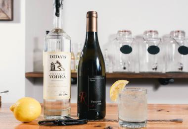
The business of designing labels for alcohol beverages worldwide is a multi-billion-dollar business, and for good reason. A customer, whether in a wine shop in Manhattan, a grocery store in Manchester, or at a bar in Munich, often makes a choice of what to buy based on nothing more than the appeal of a label. More importantly, if they are pleased with their choice, they may stay with that wine or spirit – or, more accurately, with that brand – for the rest of their lives. There is an old adage in branding that the best ones are owned not by the producer, but by the consumer. Getting to that result is not easy.
In this arena, introducing a label for a new product is a bit of a crapshoot. Customer research is helpful, but not failsafe. Yet, since the product is new, changes great and small can be tweaked without alienating a still-forming audience. A venerated brand is another matter. How should the producer ‘refresh it’ to keep up with the times and hopefully attract a younger audience, but without alienating the existing loyalists?
“It’s always good to respect a brand’s history,” says Ron Wong, founder and executive creative director of New York’s Spring Design Partners, who recently redesigned the Van Gogh vodka and flavoured vodkas product line, “but the final solution should not be a history lesson. Rather, what can we extract from its past – a truth – that will help us move to a contemporary narrative?”
The competition to get such opportunities is fierce and expensive. Creating a new business pitch can easily go into six-digit territory – euros, dollars, or pounds – with no guarantee of getting the business. So it is no wonder many design firms as well as clients work hard to maintain relationships once won. Consequently, as marketing executives move from one company to another, they often reach back for a familiar agency whose work they trust will bring results. Katz has proven to be a master of creating this loyalty.
Although she had worked before with other designers, Anne Leroy-Baroin, marketing director for the Burgundy wine producer Bouchard Père et Fils, chose Katz when “our brand identity was no longer in line with our products and the quality image we wanted,” she says. “He did not invent a new identity, but he took from our past to take us back to the company’s essence.”
“Pierre is very skilful when we speak about signs,” agrees Lejay Lagoute marketing director Dorothée Simottel, who launched a Katz brand redo of Lejay Cassis in 2013. “He is an expert on history, French typical signs, and knows very well how to translate them into signs that will last for the long-term.”
All about the wine
The son of a physician father who was a passionate art collector and a mother who was an opera singer, Katz early became fascinated with the nuances of art and literature. His interest in etymology and humanities led him to study the history of tribal art, writing, and printing. Katz credits a question on his baccalaureate while he was still in his teens for spurring his interest in typography – “Choose a word and emphasize its meaning through a consistent graphic expression.” After attending the Penninghen art school in Paris, he worked with the prestigious Carré Noir and Desgrippes agencies before venturing out on his own.
In most cases, Katz avoids elaborate presentations. “When we meet prospective clients for the first time, we might show them our portfolio and talk about how we approach branding and give a few insights on what we might be able to do for them,” Katz says. “We don’t try to innovate stylistically, as most houses want to keep within a certain tradition – a certain historical filiation – and to express their singularity within these rules that reinforce their historical legitimacy,” he continues. “A wine tells the story of a terroir, of a place, of men and women. The goal is always to reveal that story as accurately as possible with the signs and colours that originate or evoke best that place and story.”
Leroy-Baroin says for her current Bouchard project, Katz “came several times in Beaune to immerse himself in the company history and DNA. He went through all our archives and looked for old expressions, typographies, and signatures in order to present us a project that expresses the company’s roots.” Virginie Delcourt, marketing and communications director at Champagne Henriot, also helped immerse Katz in the history of the brand for a Henriot redesign that is still in progress. “We sent him a lot of documents, we made several meetings with the director of the maison, with the winemaker, Laurent Fresnet, and with the marketing team,” Delcourt says.
Within a few weeks of research being completed, Katz presents the client with three options for in-depth consideration. One of the designs – occasionally two – is selected for further development. After another presentation and working session, Katz again goes back to computerised atelier for refinement. Rather than video or slide presentations, Joséphine Katz-Trataris – who is partners in the agency with her father – says the presentations are made “on good old paper! Then we can start creating mockups by printing actual labels and decors” using techniques such as embossing, engraving, and hot stamps.
Katz emphasizes that the whole process has to be about the wine and not the label. “If you have a great wine,” he says, “clients should look at the bottle and think ‘that looks like a great wine’, not ‘what a beautiful bottle’. They should perceive its finesse, its character through the label. And the greater the wine, and the domain, the less you should gesticulate. What I have learnt with time is that great quality is better expressed through great simplicity.”
To go along with the final design, Agence Pierre Katz prepares a usage manual or ‘graphic charter’. The complete process from getting the assignment to delivering a final package takes anywhere from a few months to a year.
The process comes full circle when the client executes the marketing rollout of the new look, or perhaps more accurately, the ‘new old’ look. For the new Bouchard redesign, Leroy-Baroin says, “We want to launch the new brand image from mid-September, with multiple launching events in France and then in other key markets such as the UK, US, and Japan.”
“Typography is my domain of expertise,” Katz says, “and that is the one discipline that allows us to giving strength, character and historical density to words. We try to choose the most important information that need to appear on the label, hierarchize it, and make it clear through a harmonious composition. I always say that harmony is a factor of impact.”