Doni & Associati, based in Florence since 1975, was the one of the first graphic studios in Italy to establish its authority as specialists in designing wine labels. It remains at the forefront of label design — and a neuroscientific study shows why.
Early success
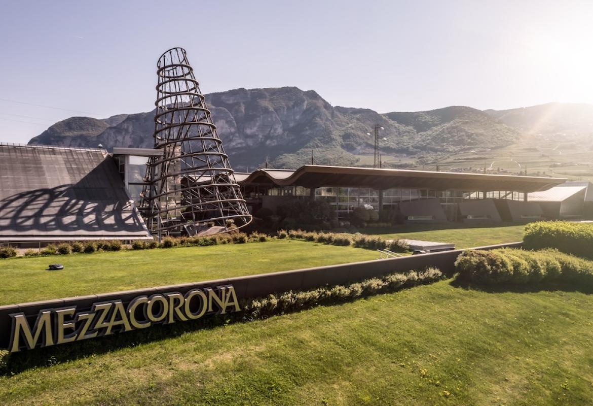
Simonetta Doni started her career in editorial art, publishing art catalogues until 1985, when she received a commission to redesign the Ser Lapo label for Mazzei’s Fonterutoli estate. Today she has more than 200 clients, some of them among the most iconic names in Italian wines: Frescobaldi, Mazzei, Barone Ricasoli, Domenico Clerico; Tedeschi, Ca’ del Bosco, Mezzacorona, Bertani, Argiolas and more. International clients include, Hambledon Vineyards, Lefkadia and Zorah.
“Ser Lapo was a challenge, because Mazzei was not looking for an artistic label,” says Doni. “I was to design a label that was able to convey a number of elements: decades of history, the wine estate and the wine, all to be summarised in a label.”
According to Francesco Mazzei, a good, well-designed label that stands out can double sales. The Ser Lapo Mazzei label, designed for the off-trade, was an innovative design yet classic, aiming to tell the story of Ser Lapo Mazzei, the Florentine notary whose 1398 document first mentions Vino di Chianti. “It’s been a success,” says Mazzei.
According to Doni, until the early 1990s most Italian wine labels were dreary, resembling ancient parchments or scrolls, or they were designed by a member of the family and made no effort to communicate the wine. Things improved in the 1990s when the concept of imagery and storytelling through labels became more evident, though according to Doni, labels were still too elaborate. “Over the past 30 years the decorative part has become more marginal. We try to develop a simple, clear, more immediate communication,” she says. “Technology has also developed that enables us to make some amazing effects through printing, colours and the material we use, such as the Zorah label, which is similar to a jewel.”
Zorah is a boutique winery owned by Armenian fashion designer Zorik Gharibian. In 2011, Gharibian asked Doni to redesign his label. She took one look at it and told him that redesigning the same theme was out of the question. She decided to recreate the label from scratch.
“Usually I don’t accept restylings, as very often there is nothing worth saving,” she says. “I prefer to start from scratch, study the case and come up with something original and ideal for the character of the wine. I’m like an artisan. My work is similar to a tailor, making to measure.”
For the Zorah label, Doni and her studio did a lot of research into Armenian culture and the land where the vineyards were planted. They paid particular attention to the iconography of the Armenian alphabet, which is based in decorative. The result was a design that was both exotic and clean, with a clear link to its cultural origins, and resembling an oriental jewel. The materials used, from the cotton paper to the sumptuous colouring make it stand out. “The wines’ names are oriental, and the message aims to communicate the geographical origin, while the ornate design aims at communicating the rarity of the product. [It’s] clearly aimed at the premium sector,” says Doni.
She adds that research is fundamental and a label can take a year or more to develop, involving meetings with the producers and sometimes with the winemaker, and visits to the winery. As for costs, these vary. Not wishing to disclose her rates, Doni says she charges within the going market rates, which start at €2,000 ($2,450) and go up to as much as €20,000 to design one label, in addition to the costs of the materials and the printing.
Doni thinks the money invested is worth it. “If a producer is prepared to pay money for a new tractor or make other useful investments, then he should be prepared to pay money for his label, as this is equally important to his success,” she says.
This, is turns out, is true.
Another great label
Frescobaldi’s Gorgona label is possibly the one that sits closest to her heart, which she describes as an “emotional” project. The island of Gorgona, just off the Tuscan coast of Livorno, has been a penal colony since 1869. It is the only penitentiary island still operating in Europe, holding male inmates convicted of murder, assault and Mafia-related crimes. To these inmates, Gorgona signifies the last stepping-stone to freedom; those who land there have spent the previous 10 to 20 years behind bars, and they spend the last three to five years on Gorgona before final release.
Frescobaldi was recently given the opportunity to purchase the vineyards on Gorgona and create a project to help rehabilitate inmates by teaching them how to make wine. It has been a successful project, both from a humanitarian and professional stand-point.
“Lamberto [Frescobaldi] came to my studio one day and asked me if I’d like to get involved in this project, to create a special label, but free of charge,” she says. “I agreed and it has been one of the most rewarding projects, involving visits to the islands, soaking in the atmosphere of the island and consequently recreating a message. A message in a bottle.”
Doni explains that the message is about inaccessibility, which explains why the label is a parchment closed with a wax seal. It’s about secrecy. But when this wraparound parchment is removed, its back reveals a bulletin, explaining the elements of the island, the wind, the sea, the earth and the life of the convicts. They did not write the material themselves, but conveyed their thoughts through Lamberto Frescobaldi and others, such as opera star Andrea Bocelli. The content changes every year. The packaging comes with an extra ‘bulletin’ sheet, which functions as collectable memorabilia. “A brilliant marketing operation for Frescobaldi,” says Doni. Technically, the paper is waterproof, so the bottle can be submerged in an ice bucket.
Gorgona is a premium bottling of 60% Vermentino and 40% Ansonica and production is limited to about 4,000 bottles, of which 2,200 bottles remain in Italy, while the rest is exported. Each bottle sells for around €90.00 ($110.00). “The label is very important and has proved very successful,” says Frescobaldi. “It represents the philosophy and tells the story of the people and of what is in the bottles, not just the wine, but also hope and the elements of the island. The price is in line with the label and packaging. It’s retro, but at the same time up-to-date, like Coco Chanel: fashion changes but the style remains.”
Not only that, the evidence from science is clear – good design makes a difference.
The neuroscience
Consumer emotions play a key role in the buying process, therefore, the ability of a visual image to arouse a positive emotional response is a benchmark for marketing goals. Doni has worked alongside Bruno Laeng, professor of cognitive neuropsychology at the University of Oslo in Norway, who has used some of Doni’s wine labels in his lectures. He has asked students to give their opinions on a series of parameters such as, brand visibility, pricing, readable content and message. He has also used eye-tracking technology, to test for individual differences in attention paid to the labels. The results have reassuring for Doni, affirming that her working methods truly do produce design that communicates.
“I do believe eye-tracking could be relevant for improving the design of wine labels and their marketing,” says Professor Laeng.
According to Laeng, eye-tracking is useful in marketing because it offers two key pieces of information. It can show where an individual is looking, and what about the label is capturing attention and for how long (this is known as the distribution of eye fixation). Secondly, measuring the pupils can show how intensely someone is paying attention to the object. Laeng specifically looked for which wine label elements captured the most attention and whether a specific label would be preferred by consumers over other alternative labels.
Laeng found that the amount of ‘gaze’ captured by a specific label was related to the degree to which a wine bottle was preferred (and potentially purchased). The research strongly suggested that it’s the pictorial elements of a label that are the most crucial, with text capturing very little attention. The most attractive labels – and, paradoxically, the least attractive labels – produced wider pupils in the test subjects, probably because both labels offered arousing stimuli. He did, however, note that the study was done on wine novices, and might not be applicable to wine connoisseurs.
“I believe that the study sketched above has some clear practical implications, because the eye-tracking methods could be used in a systematic manner to assess preferences of potential consumers before a wine label is actually selected for the market,” says Professor Laeng. “Hence the wine label designers, not to mention the wine producers, could benefit from eye-tracking methods to optimise the design process”
Doni says that the future will be about digital labels, with “with apps similar to QR codes, where you just need to scan the label with your smart phone and it will talk you through the history of the estate and the character of the wine. Materials will also develop. We already have plastic, three- dimensional labels which, if scanned. will come alive through your screen. However,” she adds. “I believe a label will always need to convey a message, a story and an emotion.”